Color Theory for Miniature Painters: Choosing the Perfect Palette for Your Models
When it comes to painting miniatures, color choices can make or break your masterpiece. A good palette can turn your model into a show-stopper, while bad color combos might leave it looking like it just stepped out of a paint explosion. Let’s dive into the world of color theory to help you choose the perfect palette for your miniatures - and maybe crack a joke or two along the way.

1. The Basics of Color Theory
Color theory might sound intimidating, but it’s just a fancy term for understanding how colors work together. At its core, it’s like building a party for your models: some colors are besties, while others don’t get along.
The Color Wheel
The color wheel is your best friend. It’s split into:
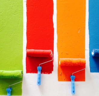
Primary Colors: Red, blue, yellow. They’re the "starter pack" of all colors.
Secondary Colors: Green, orange, purple. Made by mixing primary colors.
Tertiary Colors: The in-betweeners, like red-orange or blue-green.
Remember, colors on opposite sides of the wheel are complementary, while neighbors are analogous. (It’s like seating friends at a wedding—opposites attract, but too many similar vibes might be dull!)
2. Choosing a Palette
When picking a palette, think about the story your model tells. Is your mini a noble knight, a mischievous rogue, or a fire-breathing dragon that secretly loves baking cookies? Your colors should reflect their character.
Common Palette Types
Monochromatic: One color, multiple shades. Great for a sleek, unified look.
Complementary: Opposite colors on the wheel, like blue and orange. Bold and eye-catching.
Triadic: Three evenly spaced colors, like red, yellow, and blue. A balanced, vibrant combo.
3. The Role of Contrast
Contrast is the spice of life—and miniature painting. It makes details pop and prevents your model from looking like a blob.
Light vs. Dark
Dark base colors paired with bright highlights create depth and drama. Think of it as adding a spotlight to your mini's best features.
Warm vs. Cool
Warm colors (red, orange, yellow) evoke energy and intensity, while cool colors (blue, green, purple) feel calm and mysterious. Use this to set the mood of your model.
4. Neutrals: The Unsung Heroes
Neutrals like black, white, gray, and brown are the backstage crew of your palette. They balance bold colors and give the eye a place to rest.
Neutrals are like a good snack during painting - essential, but they don’t steal the spotlight.
5. Tell a Story with Your Colors
Every miniature has a tale to tell. Use colors to bring their personality to life:
Villains: Dark reds, blacks, and purples scream danger.
Heroes: Bright blues, whites, and golds feel noble and pure.
Nature-Themed Models: Greens, browns, and earthy tones tie them to the natural world.
6. Testing Your Palette
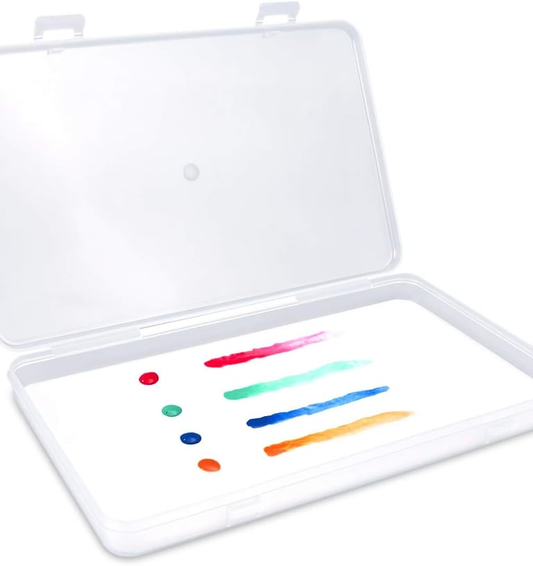
Before diving in, test your colors on a spare piece of plastic or paper. This avoids surprises and gives you a chance to tweak the scheme.
Better to ruin a test strip than your favorite mini. Trust me, I’ve been there - it’s still too soon to talk about it.
7. Advanced Techniques: Color Harmonies
Ready to level up? Explore these advanced techniques to make your palette shine:
Split Complementary: One main color and two neighbors of its complement.
Analogous Accents: A mostly analogous palette with one pop of contrast.
Gradients: Smooth transitions between colors to add depth and realism.
8. Avoiding Color Pitfalls
Here are some common mistakes to dodge:
Too Many Colors: Stick to 3-5 main colors to avoid overwhelming the viewer.
Clashing Tones: Ensure your colors don’t compete for attention.
Ignoring the Base: The base is part of the model! Make sure it complements your palette.
9. Inspiration from Nature and Art
If you’re stuck, look to nature or famous artwork for inspiration. From sunsets to Van Gogh, the world is full of incredible palettes.


Bonus: No one can argue with a palette inspired by Mother Nature herself.
10. Practice Makes Perfect
The more you experiment, the better you’ll get. Start with simple models, and don’t be afraid to make mistakes—every misstep is a learning opportunity.
After all, even Picasso had to start somewhere. Probably with finger paints.
Final Thoughts
Understanding color theory isn’t just for art school grads—it’s a powerful tool to elevate your miniature painting. With a little practice and a lot of creativity, your models will be the envy of the tabletop.
Want to share your colorful creations or need feedback on a palette? Join the GerbilForge community and let’s nerd out together!